The plotting functions in orbitr are built to get you a picture in one line so that you can get back to the physics. That is the right design for exploring and the wrong one for publishing, where the picture needs the units, labels, colors, and size that your journal or your slides demand. The good news is that there is no gap between the two: plot_orbits() returns a ggplot you can keep modifying, and everything else is a tibble you can plot however you like. This chapter is the short, practical one. It collects the plotting patterns the rest of the book has been using, adds the ones a paper or a talk needs, and says where the interactive and animated output fits.
14.1plot_orbits() is a ggplot
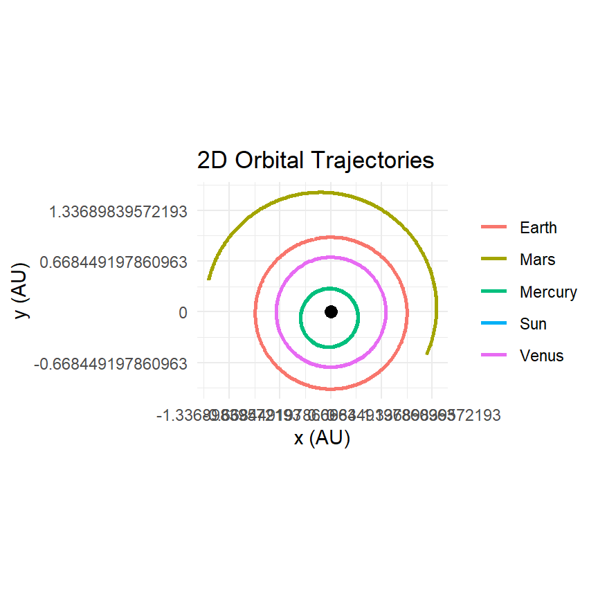
Anything you can add to a ggplot you can add to the output of plot_orbits(). The most common fixes are a marker for the central body, which is otherwise invisible because it barely moves; axis labels in sensible units; and a theme:
AU <- distance_earth_suninner <-create_system() |>add_sun() |>add_planet("Mercury", parent ="Sun") |>add_planet("Venus", parent ="Sun") |>add_planet("Earth", parent ="Sun") |>add_planet("Mars", parent ="Sun") |>simulate_system(time_step = seconds_per_day, duration = seconds_per_year)plot_orbits(inner, three_d =FALSE) +annotate("point", x =0, y =0, size =3) +scale_x_continuous(labels =function(m) m / AU) +scale_y_continuous(labels =function(m) m / AU) +labs(x ="x (AU)", y ="y (AU)", color =NULL)
Figure 14.1: The default plot with three additions: a marker for the Sun, axis labels, and a scale in AU.
The scale functions relabel the axes without touching the data, which keeps coord_equal() honest. If you would rather convert the data, do it before plotting, as the next section does.
14.2 Your own plots from the tibble
The built-in plot draws one path per body. Everything else is a mutate() and a ggplot(). Four patterns cover most needs.
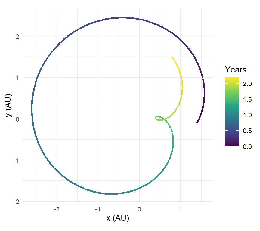
Color by time, to show direction and speed along a path:
create_system() |>add_sun() |>add_planet("Earth", parent ="Sun") |>add_planet("Mars", parent ="Sun", nu =60) |>simulate_system(time_step = seconds_per_day, duration = seconds_per_year *2.2) |>shift_reference_frame("Earth", keep_center =FALSE) |>filter(id =="Mars") |>ggplot(aes(x / AU, y / AU, color = time / seconds_per_year)) +geom_path(linewidth =0.9) +scale_color_viridis_c() +coord_equal() +labs(x ="x (AU)", y ="y (AU)", color ="Years")
Figure 14.2: Mars seen from Earth over two years, colored by time. The color gradient makes the direction of motion and the retrograde loop readable without an animation.
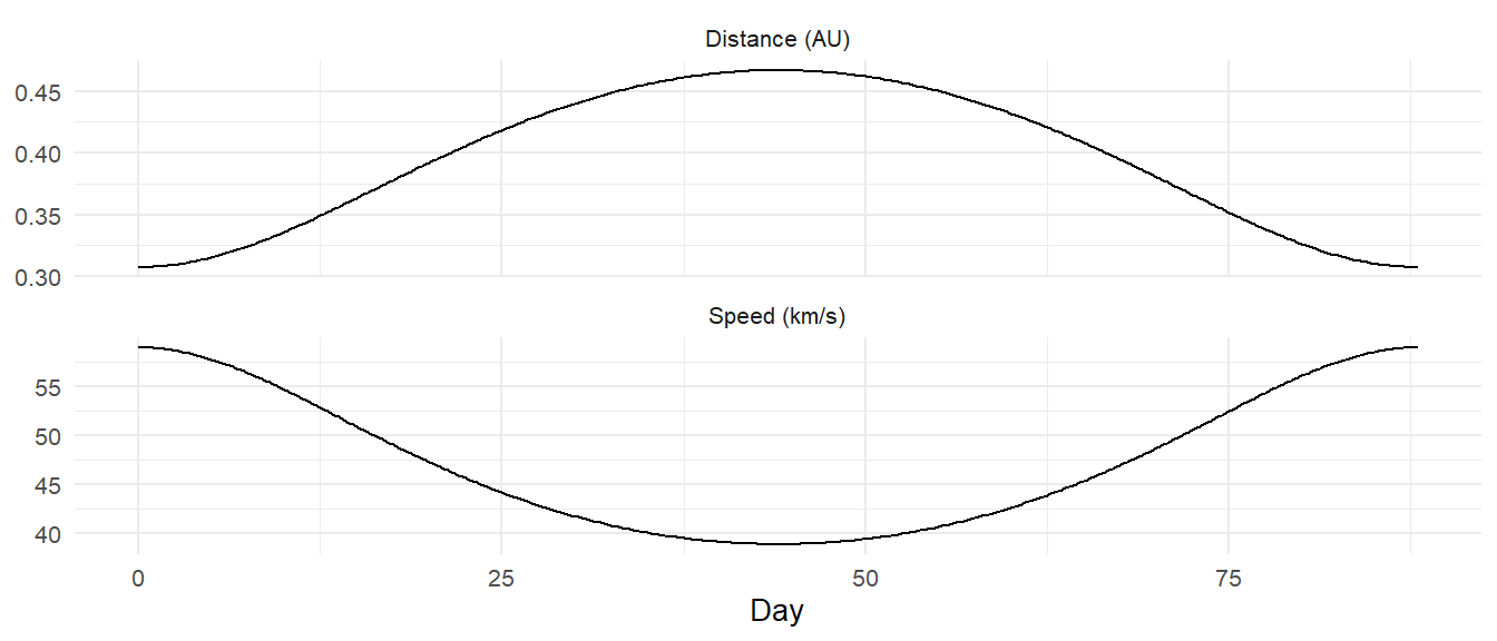
Time series of any derived quantity: distance, speed, energy, an orbital element. The pattern is always mutate() the quantity, then aes(time, quantity):
Figure 14.3: Mercury’s heliocentric distance and speed over one orbit, as time series. Two panels from one tibble via pivot_longer().
Small multiples with facet_wrap(), which is how most of this book’s comparisons were drawn: give each run a label column with mutate(run = "..."), bind_rows() them, and facet by it. Chapter 5’s integrator comparison and Chapter 6’s encounter figure are both this pattern.
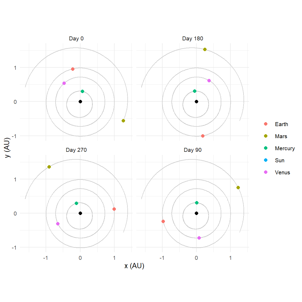
Snapshots in a grid.plot_system() draws one instant. For a sequence of instants in a paper, where an animation is not an option, overlay the full paths in grey and facet the positions by time:
days <-c(0, 90, 180, 270)snapshots <-bind_rows(lapply(days, function(d) { inner |>filter(abs(time - d * seconds_per_day) < seconds_per_day /2) |>mutate(day =paste("Day", d))}))ggplot() +geom_path(data = inner, aes(x / AU, y / AU, group = id), color ="grey80") +geom_point(data = snapshots, aes(x / AU, y / AU, color = id), size =2) +annotate("point", x =0, y =0, size =2) +coord_equal() +facet_wrap(~ day) +labs(x ="x (AU)", y ="y (AU)", color =NULL)
Figure 14.4: The inner solar system at four instants, with the full year’s paths behind. A static substitute for an animation.
14.3 A figure for a paper
A journal figure has a few requirements that an exploratory plot does not: a fixed physical size, a font size that will still be legible after the figure is shrunk to a column, a color scheme that survives greyscale printing and colorblind readers, and vector output. Here is a recipe:
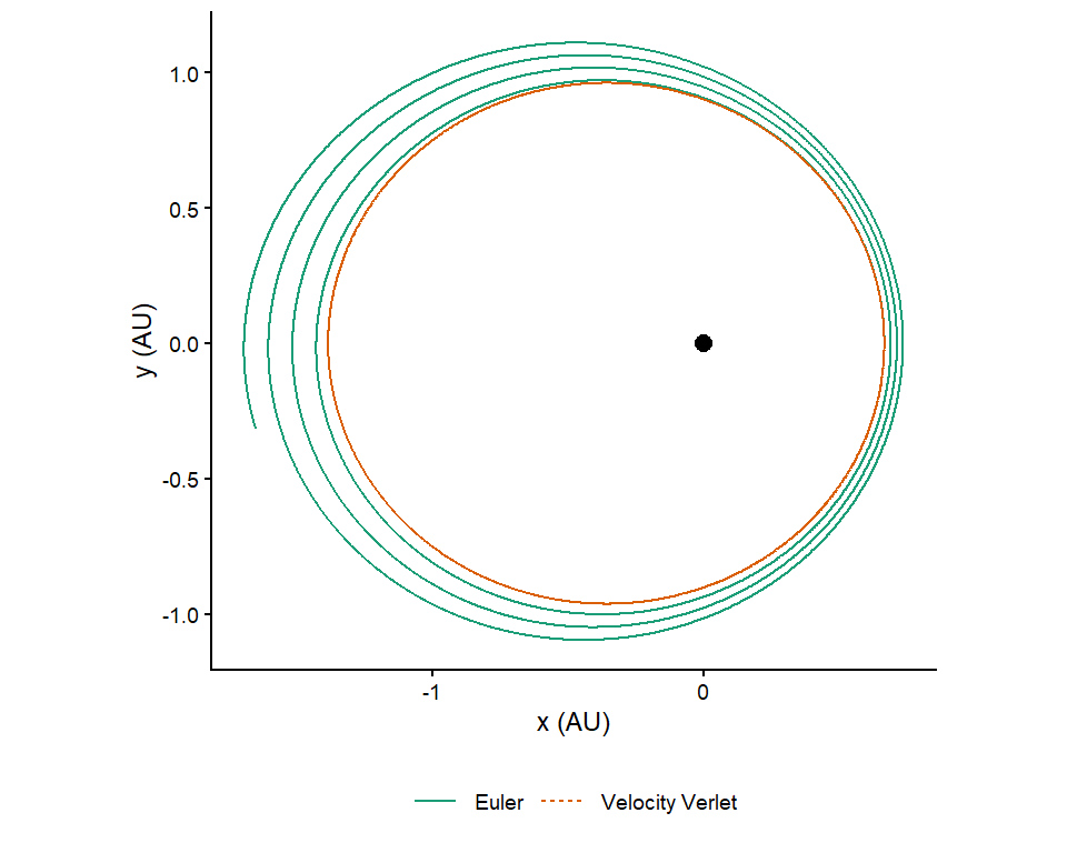
star_planet <-create_system() |>add_body("Star", mass =1e30) |>add_body("Planet", mass =1e24, x =1e11, vy =30000)comparison <-bind_rows(lapply(c("verlet", "euler"), function(m) { star_planet |>simulate_system(time_step = seconds_per_hour *6,duration = seconds_per_year *6, method = m) |>filter(id =="Planet") |>mutate(method =c(verlet ="Velocity Verlet", euler ="Euler")[m])}))paper_figure <- comparison |>ggplot(aes(x / AU, y / AU, color = method, linetype = method)) +geom_path(linewidth =0.5) +annotate("point", x =0, y =0, size =2.5) +scale_color_brewer(palette ="Dark2") +coord_equal() +labs(x ="x (AU)", y ="y (AU)", color =NULL, linetype =NULL) +theme_classic(base_size =9) +theme(legend.position ="bottom")paper_figure
Figure 14.5: A publication-style version of Chapter 5’s integrator comparison: colorblind-safe palette, distinct line types so the figure works in greyscale, a classic theme, and labels in the units a reader expects.
Save it at the size it will be printed, as a vector file:
ggsave("integrators.pdf", paper_figure, width =3.4, height =3.0, units ="in")ggsave("integrators.png", paper_figure, width =3.4, height =3.0, units ="in",dpi =600)
A single-column figure in most journals is about 3.4 inches wide; set base_size so that the text is 7 to 9 points at that size. The PDF is what you submit; the PNG is for the slide.
Two things to watch. Orbit plots need coord_equal(), or circles become ellipses and the eye reads an eccentricity that is not there. And when the data span orders of magnitude, as a comet’s distance does, a logarithmic axis (scale_y_log10()) is usually right, as it was in Chapter 11.
14.4 Interactive 3D for the screen
Any system with motion out of the plane dispatches to plotly automatically, and plot_orbits_3d() and plot_system_3d() force it: